
Inc. Redesign Required ‘Political Acumen’
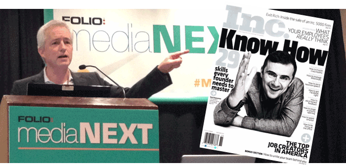
Every magazine needs to refresh its brand once in a while. But when Inc. decided its own time had come for a design makeover, editor-in-chief Eric Schurenberg (pictured) realized he had to approach the task with a certain degree of delicacy.
“We have a brand that is really powerful,” he told an audience at a recent Folio Magazine MediaNext conference. “It has been around a long time and redesigning that brand is something you want to approach very carefully.”
The wrong design moves can do more harm than good. Get too far ahead of the reader and you risk a subscriber revolt; lag too far behind and you flirt with irrelevance.
Satisfying the public, in short, is a challenge. “Readers never ask for a redesign,” Schurenberg pointed out. “In fact, after a redesign most readers write you pathetic letters saying what did you do to my magazine? Bring it back! But you have to change with the times. You have to evolve with the way readers evolve in their readership habits–whether they recognize it or not.”
Then there’s another group of stakeholders to think about. “Unlike readers, advertisers will ask for a redesign,” says Schurenberg. “They want to be next to the latest and hottest thing in an environment where their product looks good by association. If there were no other reason to redesign a publishing property, satisfying advertisers would be a sufficient one.”
Internally, a magazine redesign promises important benefits: Ripping up and reassembling a brand can help facilitate a productive editorial environment. “From the managerial point of view a redesign allows me to tell my staff we are making a clean break from the past,” said Schurenberg. “I don’t have to put myself in the position of saying that a column or an article is dumb; it’s better to say ‘we are rethinking from the ground up and doing a whole new redesign.’”
Play politics
A successful redesign engages the entire publishing team. “A redesign in the real world is not just an act of creativity; it’s also an act requiring political acumen,” cautioned Schurenberg. Everyone wants to feel included. “You have to go around to all the stakeholders and find out what they hope to achieve. That’s often very different from what you had in mind.” Every suggestion is valuable, he added: Even ideas uninformed by design expertise can be interpreted by a professional in ways that strengthen the final product.
Schurenberg consulted with staff editors as well as the company president and the directors of sales and creative. One theme common to everyone: Go big. “No one said ‘let’s just adjust things, let’s make incremental improvements,” said Schurenberg. The company president, for example “didn’t want to spend all that money and then have to report to the owner that we had something no one could recognize as being really different.”
For ideas to prime the pump Schurenberg looked at two recently retooled magazines: Garden and Gun, and Institutional Investor. “They were both designed by the same guy: Tom Brown of Vancouver,” said Schurenberg. “We decided he would be our redesign guru for the new look of Inc.”
Coordinate efforts . . .
From the start Inc. aimed for a coordinated print and web effort. “Integration is key,” said Schurenberg. “Not only artistically but also because advertisers increasingly want to see their creative in what looks like the same environment across platforms.”
A good deal of the success in doing so relies on the appeal of identical fonts which look good in both the magazine and the web. “The most fundamental element in a redesign is the choice of fonts,” said Schurenberg. “Tom Brown selected two which work beautifully together: Klavika for display and Mercury for body copy.”
 The two media are also tied together by a graphic flourish. “Tom Brown is known for little graphic signatures,” said Schurenberg. “For Inc. he designed this squiggle around the captions. I have dubbed it ‘the mark of Zorro.’”
Coordinated they may be, but print and web also demanded substantial individual effort. Which medium would receive the initial round of attention? “We decided to start with the magazine,” said Schurenberg. In defending the ‘paper first’ approach Schurenberg suggested audience members consider their own experiences. “How many of your star subjects want to be on the cover of your magazine?” he posed. “How many find that thrilling and how many have their PR people bend your editor’s ear to get that? Now think: How many put the same effort into getting on the home page of your web site?”
But perhaps the paper-first decision relied less on sober analysis and more on the Inc. culture, suggested Schurenberg. “The magazine is the flagship of Inc. Somehow the print version of a publication confers an authority, a validation that the web site just doesn’t have.”
The most important element in the print redesign was something that was hiding in plain sight: paper. Schurenberg had learned from his previous experience redesigning Money Magazine that poor paper can muddy the best looking visuals. “From the beginning of the redesign of Inc. I made it clear that the whole exercise would be pointless if we kept using the same cut rate paper,” said Schurenberg.
Schurenberg’s appeal was successful. “The owner agreed to increase the paper quality by 40 percent. It was absolutely essential to the success of the redesign. Probably something around 50 percent of the praise this redesign has garnered is actually praise for the quality of the paper.”
. . . from web to print . . .
Print is king but web is counselor. The Inc. web site provided useful clues into reader proclivities that helped guide the print remake. One was the value audiences place on news categories. “We know that readers on the web site are used to getting channels of information,” noted Schurenberg. “Channels are useful for categorizing the huge mass of information on the web site and are also very good ways to package content for advertisers.”
In a manner similar to the web site, the print magazine content was broken down into four channels. Three were Launch (about startups); Lead (about leadership), and Innovate. The fourth channel rotates among the three topics of Money (raising or managing); Technology; and Make (about manufacturing in the US by entrepreneurs). “Every channel has its own pacing, its own short stories, a newsy upfront, features and columns,” pointed out Schurenberg. “Each is distinguished by a title page and a color.”
The web also offered insights into reader pacing in the digital era. “You can’t escape the fact that readers love listicles,” said Schurenberg. “And readers run out of steam at around 750 words for an article. So we went on to create a lot of one page stories that top out around 650 words.”
. . . and from print to web
If the web site provided reader behavior insights that could be used to redesign the paper magazine, the latter offered resources to energize the web site.
The first: photographs. “Inc., like other magazines, has a photo department with editors,” said Schurenberg. “It has relationships with photographers and studios and sends people out on shoots. We don’t do that on Inc.com; it’s hard to imagine how you could justify the cost.”
But photos from the print edition can be used on the electronic one. “We get beautiful photography, 90 percent of which doesn’t have to end up on the cutting room floor because it can move over to Inc.com”
And photography means more than just single shots: Photo essays, long popular in the print universe, can be transmogrified into online slide shows. The latter are popular, if somewhat controversial. “Slide shows are a cheap way to get clicks and are often looked down on,” said Schurenberg. That need not be the case. “If they start out as photo essays by professional photographers and are carefully thought out then you can do all the slide shows you want.”
Another print resource: infographics. “The trouble required to put them together means that on most web sites infographics are created by someone else and often associated with advertisers,” said Schurenberg. The print magazine, with its full staff, can economically justify the production of infographics that move online.
Finally, the print magazine offers its web site partner a possibly counterintuitive resource: lengthy articles. “Magazines are of course the last bastion of long form journalism,” said Schurenberg. “But let it not be said that web readers have no appetite for features.”
Schurenberg cited as example a lengthy feature, recently published in print, on the psychological cost of being an entrepreneur. “When it went online it got 50,000 shares–the second most shares of any story we have ever done–even those stories of 650 words,” said Schurenberg. “The subject touched a nerve among readers.”
White space and photos
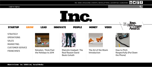
The web site redesign presented its own challenge: How would Inc. transmute the mandate for elegance and boldness into pixels? One way was to clean up the presentation. “Our web designer Haewon Kye created a lot more white space,” said Schurenberg. “This made the site look very different from the one before which—like so many other web sites—had become more cluttered over time.”
A second element was the introduction of larger photographs. “Our original carousel images were 575 by 250 or so,” said Schurenberg. “Now they are 970 by 450. They pack a much bigger punch and make the site look better and show off the magazine photography in a much better way.”
The third decision was to offer more content. “Previously Inc. had followed the blogger river lineup on its channel and home pages,” said Schurenberg. “We went to a pin board which allowed us to service a lot more content.”
Now visitors to the Inc. web site immediately see four stories. Scrolling to the right or the left reveals four more. Hovering the mouse over the channel navigation heads uncovers still more. “Altogether without scrolling down you see 48 stories just by moving the mouse around,” said Schurenberg. “With the previous design you had to wait for the carousel and you would see five stories in 15 to 20 seconds.” The new design puts more hooks in the water to land more impressions.
 The pinboard layout also facilitated the abandonment of the customary advertising location. “Readers have been conditioned to think of the right rail as the other side of the tracks, a place where you never need to look,” said Schurenberg. In contrast, the pinboard layout allows ads to be integrated with—while clearly differentiated from—editorial. “By getting rid of the right rail we have increased our usable space and created a more fetching design.”
It all comes together to create an integrated experience which is immediately discernible to the public eye. “If you are walking behind someone and they drop a magazine and it opens to a spread you should know what magazine it is without looking at the cover,” said Schurenberg. “You can do that now with Inc. And if someone drops a laptop and it opens to our site you know it is Inc.—even if all you have ever read was the print magazine.”
The redesign seems to have reached its goal. “So far responses are running three to one in favor of the print redesign,” said Schurenberg. “That’s far better than I expected.” Online results, he added, are harder to come by. Not only is the redesign still too new, but web site remakes always create technical problems that can muddy the reader acceptance picture.
While the redesign has been a success, challenges remain. One of the more difficult is the feeding of the voracious picture monster. “We have a site that strives to be as beautiful as possible, so we can’t get away with stock images,” said Schurenberg. “That increases the burden on the photo editor who has to come up with interesting images that are worthy of 970 by 450. That is a full time job. We do about 40 pieces of copy a day.”
Photo and story by Phillip M. Perry
Written November 20, 2013
